The Do’s and Don’ts of Web Design in 2024

Think of your company’s web design as a book, a book containing a story that you really want to tell. The book is your website, and the cover is your homepage or landing page. Unfortunately, unlike what your mom might have taught you, this book is judged by its cover. And in this new digital age of website users, first impressions matter
Setting up a simple yet functional website design for your small business is often more work than most people expect. Web designers will often have their own ideas about design and aesthetics that clash with your own business’s approach.
Regardless, there are a few unmistakable points to keep in mind when designing your website’s homepage or landing pages, and we’ll explore them below.
Catch Their Attention!
This cannot be stressed enough. Some say that if your viewer’s attention is not caught within the first 4 seconds after landing on your website, you’ve missed your chance. There are many ways to grab your viewer’s attention, but the most valuable way is by clearly presenting what it is that your website offers.
Resting on the odds that visitors are on your website already because they believe you may offer what they are looking for, it is important to keep the most important sections of your website easily accessible. Avoid cluttering your homepage with too much information. Instead, go for a clean and direct message, complemented with some nice graphics to sooth the eye.
…but Don’t Blind Them!
If you are still trying to stand out with flashing words, animations and brightly coloured text, I’ve got news for you. Your website is painful to open. In the early days of geocities and their ilk, website users were easily drawn to cheap animations, like a kitten to string. But today, we are living in a more digitally-mature world. So just don’t.
Keep a Cohesive Design
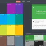
People like it when things are familiar. Take a look at any well-established brand’s website. Notice that across all sections of their website, the same visual theme and website colour scheme is maintained. The goal here is to keep things familiar to users as they navigate through your website. Keeping thing uniform across the board also makes it easier for your users to understand your brand and connect with it whenever they see it elsewhere.
Maintain a Clean Information Hierarchy
With the use of website templates becoming more prevalent, it is less likely to see these days than before, but the problem does somehow still exist for some poor business owners. If you want someone to easily find the part of the story you want to tell (or, to toss the metaphor out the window: if you want someone to find the product that your business is selling) you are going to have to make it easy to find.
A book would use a list of contents, and the pages that go along with that contents page will usually lead you in the right direction. Some web designers, however, still make the mistake of laying out the navigational menus in their site in the most haphazard and nonsensical ways.
For the love of bandwidth, please make sure the information in your site is categorized and laid out in a way that you expect your users will be able to make sense of, otherwise they will not want to look at anything on your site.
Don’t Rest on the Laurels of a Good Homepage
In an increasing trend of user ‘improvement’, webmasters are starting to notice that visitors no longer navigate to their homepages and rely on the website’s navigational layout to go where they want to. Often users will have bookmarked the page they know they would like to revisit, or will find their way to your site by a link someone else provides, providing no guarantee that they will land on your homepage when they land on your website.
For this reason it is essential that you treat all the important pages on your website as highly important landing pages that will act as a user’s first impression of your site. Having taken care of your landing pages, you can rest assured that using a proper information hierarchy and not using a cluttered design will all add together to create a usable and good-looking website.
Watch Out for the Fakes
There are hundreds, if not thousands of websites out there that promise to build you a beautiful website for free, and they expect you to believe it, too. Unfortunately, if you’re going to have a successful and good-looking website that is going to catch your audience’s attention, you’re going to have to make sure that that website is built by an experienced web designer.


