Designing the Color Scheme of Your Website in 2023

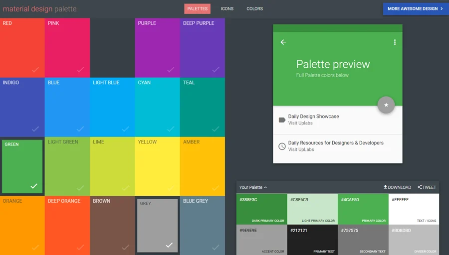
When designing a website, one of the primary considerations is the colour scheme. Selecting a judicious colour scheme for your website plays an important role in how users interact with it later on. Different website colours invoke different emotions, and you want to leverage this to drive website conversions.
Choosing Your Website Colour Scheme
Did you know the colour red attracts the eye more than any other colour? Did you know yellow is the easiest colour to see from a distance? The goal here is to guide a potential customer’s eyes through your website’s colours.
Say you are a financial business. Branding your website with certain colours might make a huge difference in how your visitors interact with it. Sure, that red base template looks like a winner, but your financial company won’t be. Your users might be thinking about pizza when you’re trying to set up a retirement fund.
“Ok, I understand; I should pick green then…?”. That’s Okay, George. But what shade of green and what offsetting colours are you going to use? Are you going to match the photos with the base colour? Are you going to use highlighting colours in your text that clash with or complement the design? Will I be able to read the text because it’s placed on a contrasting background?
All these questions are important when deciding on a colour scheme for your website. The bottom line is that using the wrong colours can ruin an otherwise professionally designed website.
Website Colour Palettes
Generally speaking, the web design colour palette is broadly divided into three categories: Warm colours, Cool colours, and Neutral colours.
Warm Colours
Warm colours have an exciting and invigorating effect on your website’s users. Red, pink, yellow, orange, and gold are all warm colours. On their own, they may become overly stimulating and oppressive, so use them in contrast with a muter shade. The various meanings associated with these colours are:
- Red shows love, energy, passion, heat, anger, danger, and warning.
- Pink is happy, feminine, and sweet. Its negative side shows immaturity and weakness.
- Yellow depicts brightness, energy, and happiness. It also represents cowardice and irresponsibility.
- Orange shows courage, confidence, warmth, sluggishness, and ignorance.
- Gold shows wealth, prosperity, and greed.
- Cool Colours
Cool colours
Cool colours have a calm, soothing effect. Blue, purple, silver, and green are the cool colours. If used excessively on their own, they may make the site impersonal and dull. Synchronising a cool colour with a warmer hue gives great results. The various meanings associated with these colours are:
- Blue shows tranquilly, trust, and intelligence. Their negative connotations are coldness and fear. Blue is also representative of masculinity.
- Green depicts money, fertility, growth, and healing. On the flip side, it denotes envy, greed, and jealousy.
- Purple shows luxury, royalty, ambition, and mystery.
- Silver represents glamour, high technology, and sleekness.
Neutral Colours
The most common neutral colours are brown, black, tan, white, and grey. On their own, they are nondescript and dull. They are great for balancing the effect of the other colours. The ideal website is designed with neutral colours pepped up with other brighter colours.
Types of Website Colour Schemes
Website colour schemes can be classified as either Monochromatic, Same group, or Contrast.
Monochromatic
The monochromatic colour scheme uses variations of only one colour for the entire design. This classy scheme works very well for business websites. Too much dependence on a single colour may turn boring, and judicious use of a neutral colour may elevate the problem.
Same Group
Same Group group colour scheme uses two similar looking colours, e.g., Blue and purple or red and orange. This may turn out to be a very elegant design. Although too much use of a similar-looking palette does not make your site monotonous.
Contrast
A contrast colour scheme uses two absolutely opposite colours, e.g., black and white, red and green, or blue and orange. Sometimes the contrast becomes too strong, and the resultant website is glaring to the eyes.
To get over this, pick a softer hue of one colour to offset the other. For instance, royal blue and orange will be horrendous, but a pale sky blue used with a peachy orange would look fresh.
Useful Tips on Choosing Website Colours
- If your website has a very bold colour scheme, it distracts users from consuming the actual website content. It is important to ensure that your choice of colours enhances your website, not divert attention from it.
- When designing your website’s colour scheme, choose from the 256-colour palette that web browsers can see. Using the colours outside this palette will result in dithering, giving a speckled look to the object. Always go for browser-safe colours only.
- Yellow is an attention-grabbing colour. Use it for banners and teasers. Once you have dragged the user’s attention to your website, there is no point in giving them eye fatigue. Avoid excessive use of such attention-seeking colours as red and yellow.
- Some colours, like orange on a blue background, are difficult to read. If your choice of colours gives users a headache, your website’s popularity will naturally drop.
- On the other hand, your website becomes drab and monotonous if it has too few colours or is predominantly white. Sure, white is a good background for large chunks of text, but jazz it up with textures and contrasting buttons.
- Never compare the colours of your printed branding materials with those on your website. Sometimes, what may be a really exquisite colour scheme on a printed card may not turn out so well on the screen. Each colour is represented differently on, say, a brochure and the monitor.
- Keep your website’s colour scheme consistent throughout. It is perfectly okay to choose purple as a hyperlink colour, but ensure that it is the same all over. Avoid variations in text colour or a drastic change in the general colour scheme between your website pages.
- The contrast between the text colour and the background should be enough to be differentiated without being glaring.
- Take the age of the targeted viewers into consideration. Kids websites should have a vivid and contrasting colour palette, whereas a website meant for a more mature audience would be toned down and elegant.
A website that is designed with an exquisitely planned colour scheme is a delight to visit and interact with. Take care of these pointers and turn your website into elegance personified.


